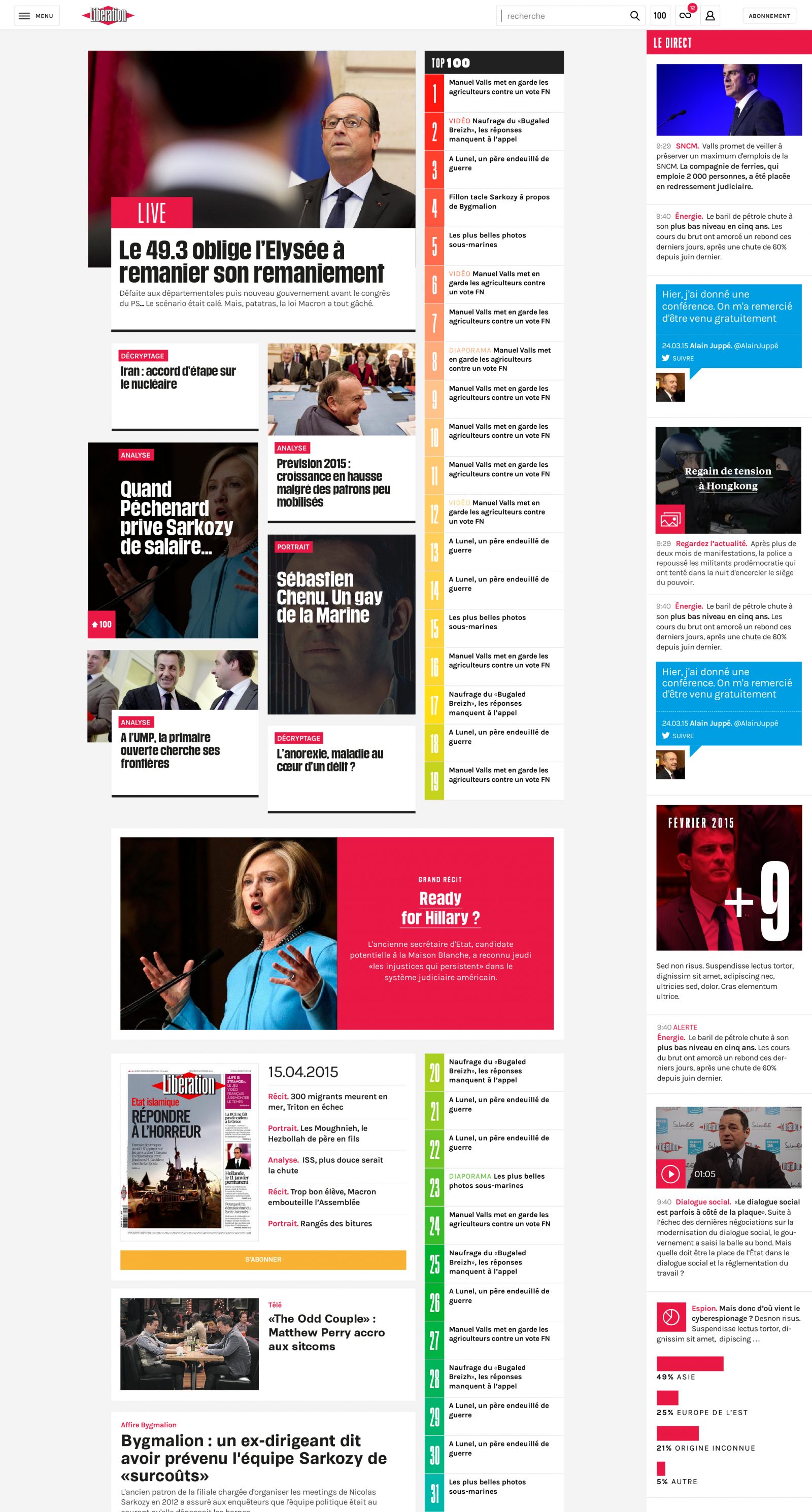
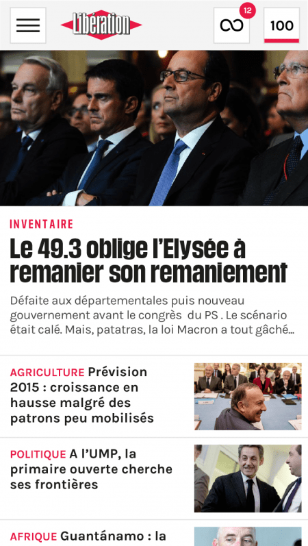
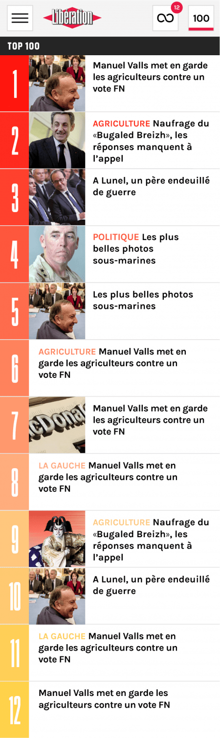
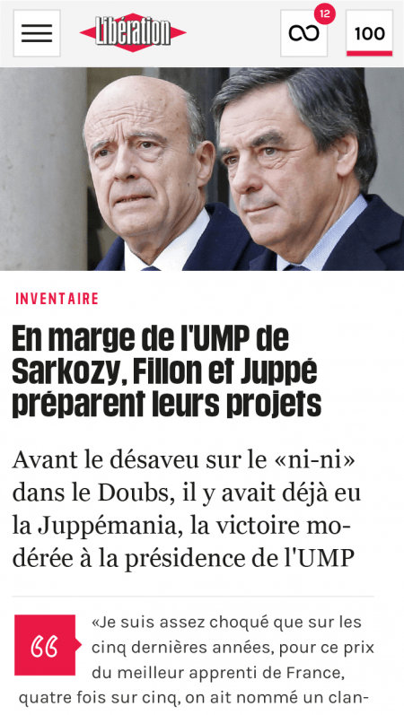
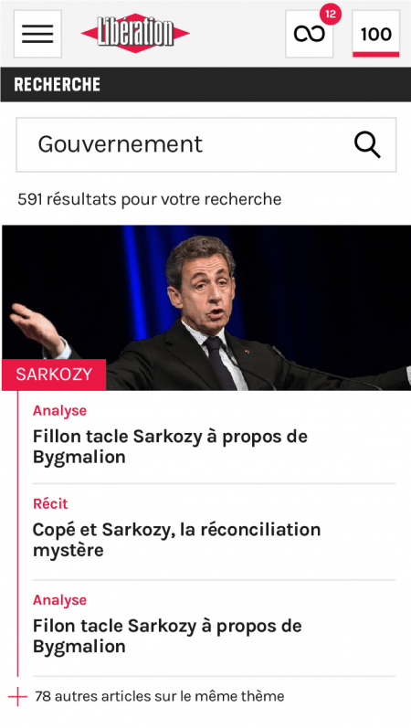
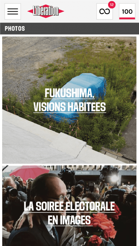
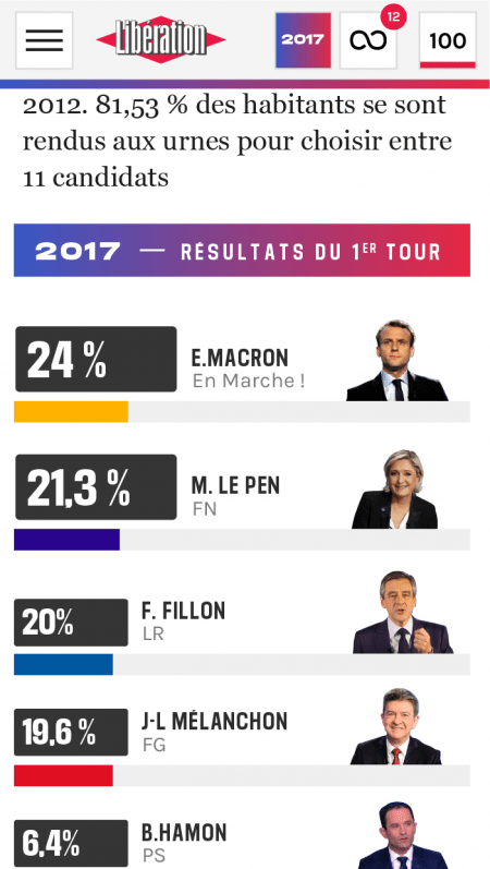
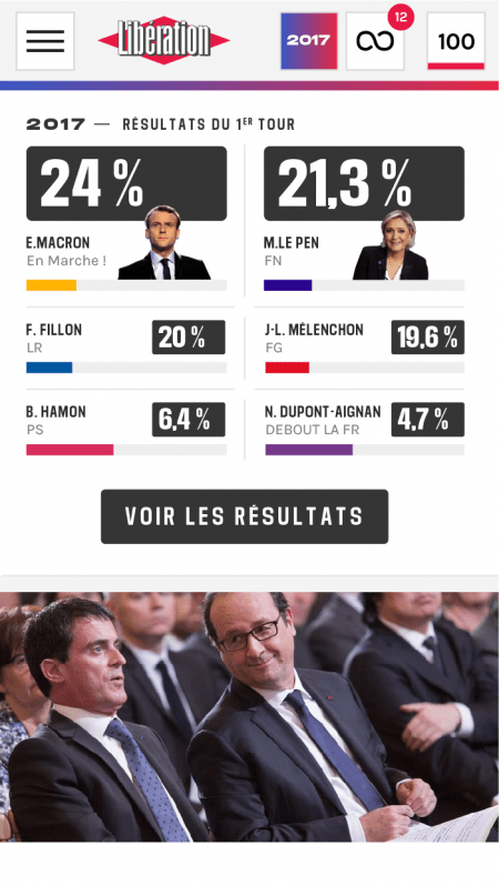
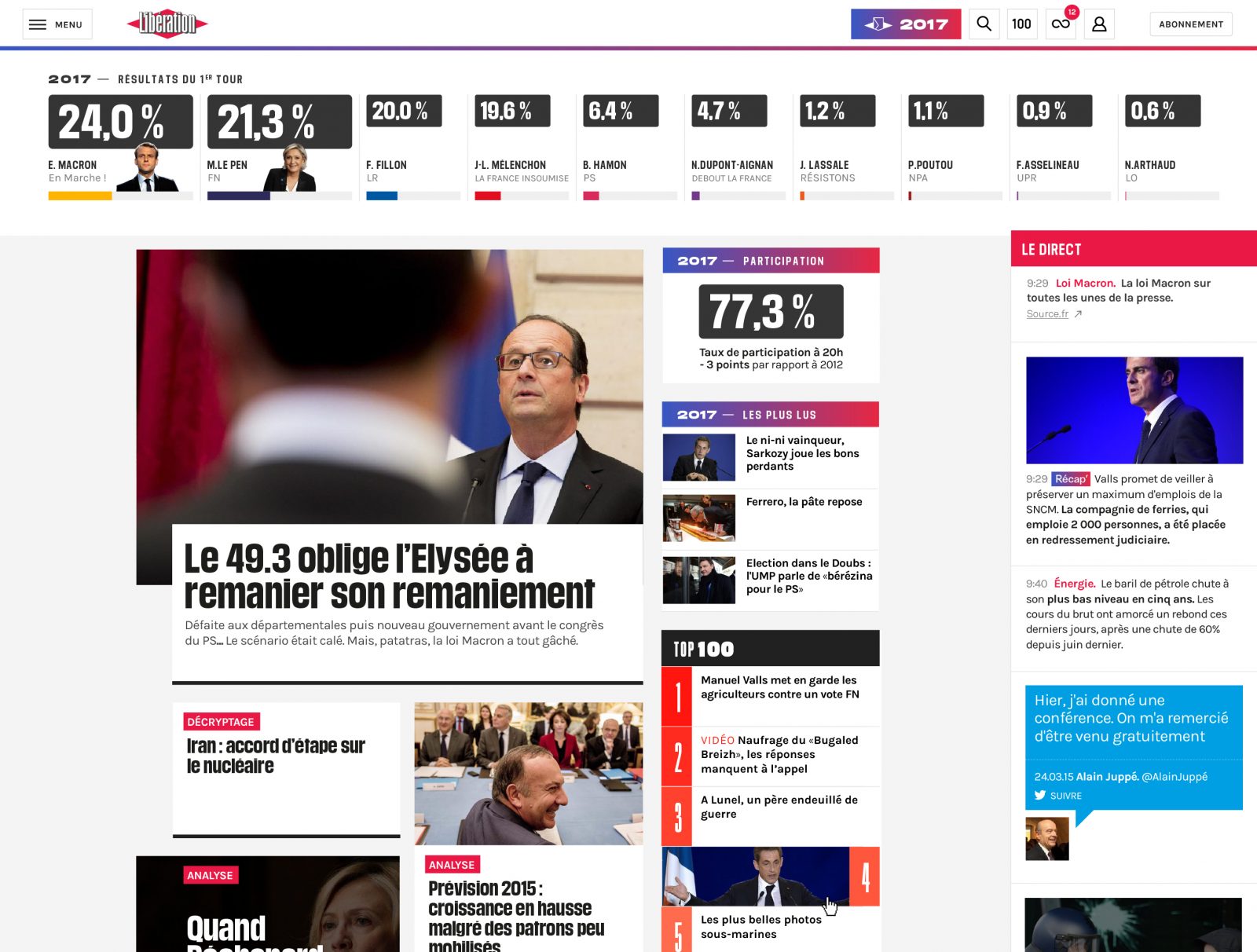
Infographic and mapping guidelines were produced in parallel to preserve consistency between the publication and web site. Concretely, this involved many different models for visualizations of the data made available to journalists on a daily basis.
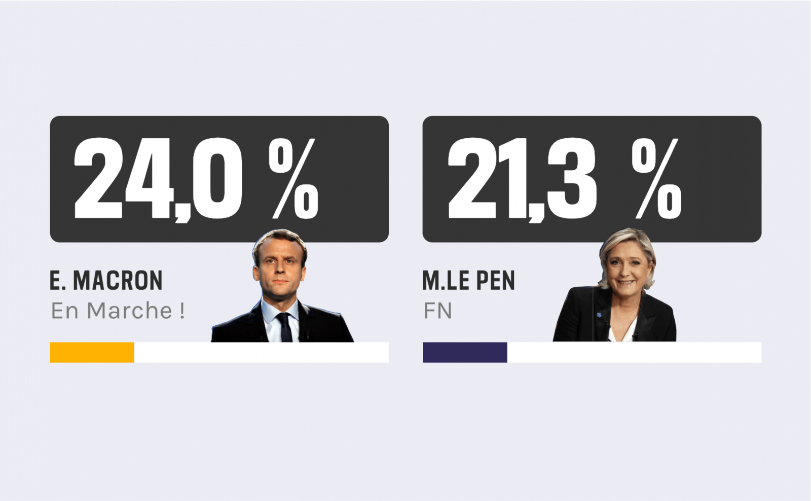
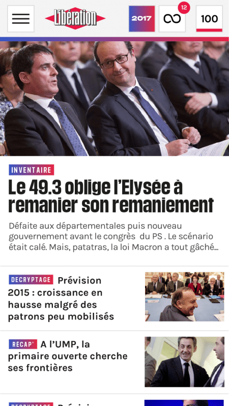
Datagif
The digital transformation of Libération, from monetization strategy to publishing formats.
Infographic and mapping guidelines were produced in parallel to preserve consistency between the publication and web site. Concretely, this involved many different models for visualizations of the data made available to journalists on a daily basis.
You need more ?...
How do you make railway renovation works seem interesting and positive to the average rider? Let us take care of it.
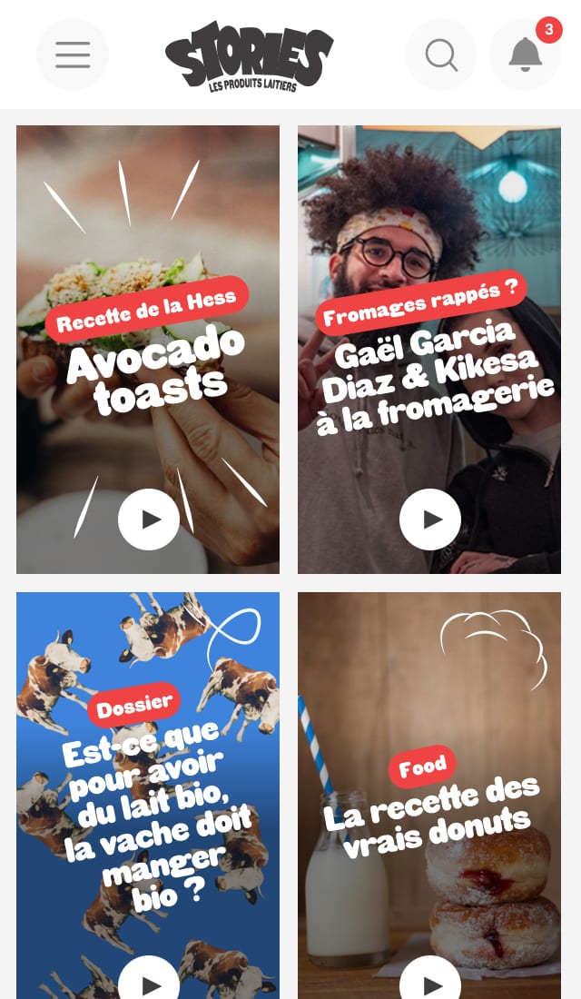
How do you turn an encyclopedic showcase site into a magazine organized into several themes?
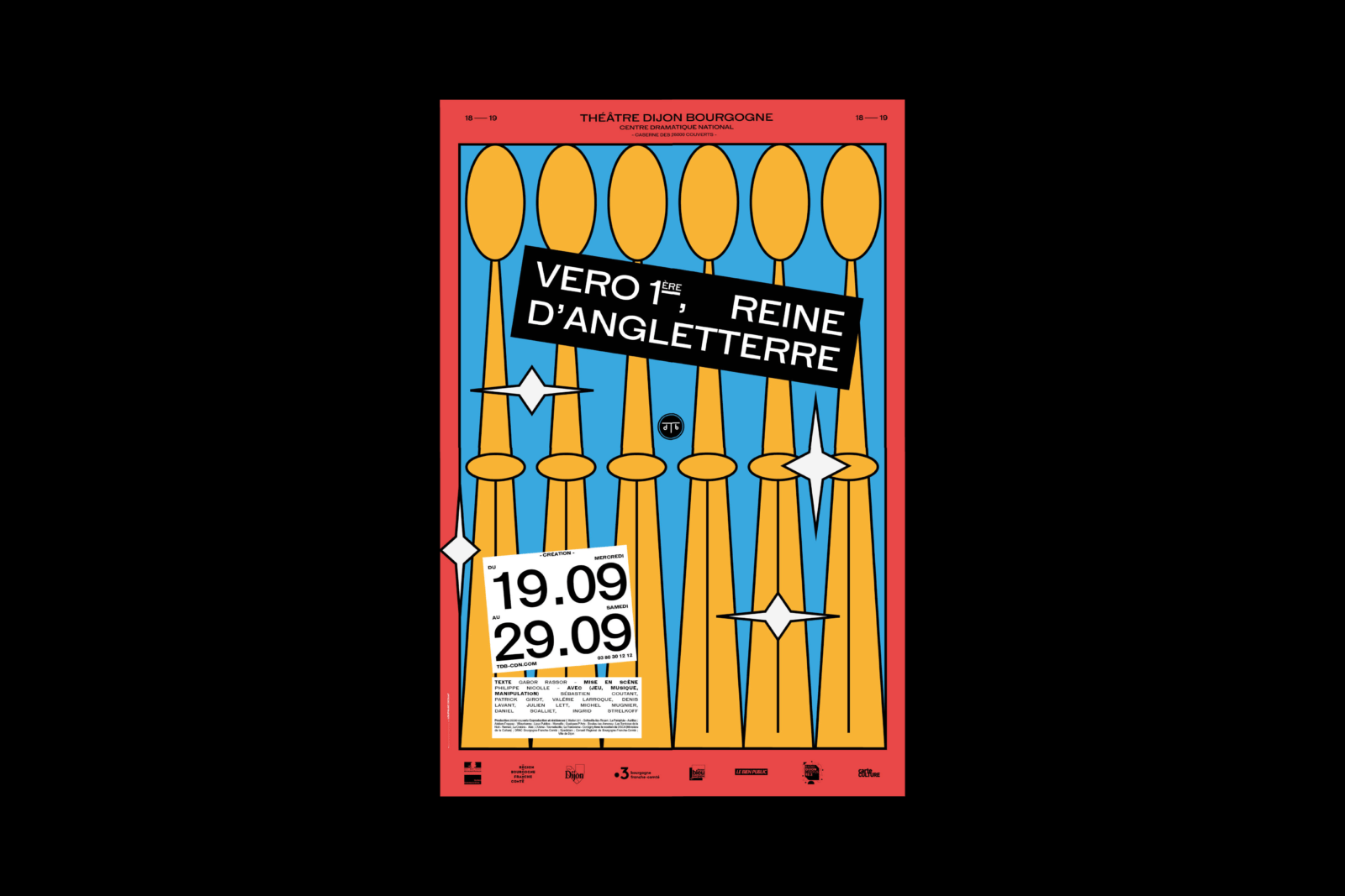
The 6th season under the artistic direction of Datagif, and still in love.
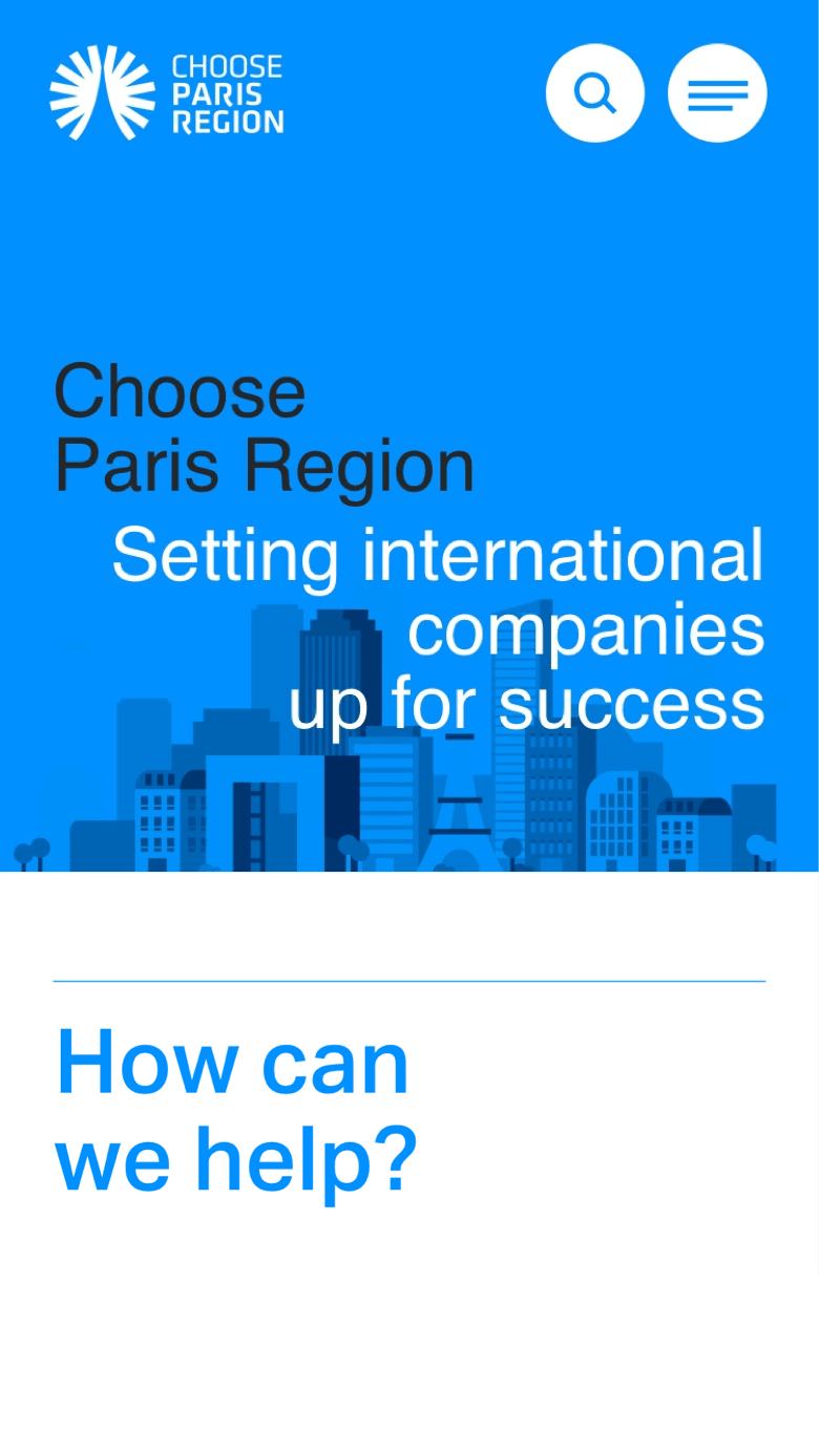
Showing foreign investors the value of the Paris region